


What colour goes with brown?
In this article, we'll examine this much-misunderstood tint and discover what colours go with brown. We'll also discuss the different types of paints and where you can use them.


Since completing his fashion marketing degree and spending a year working in luxury PR in London James has spent 8 years living and breathing wallpaper and interior design. Joining Graham & Brown in 2015 working through the marketing and product teams before spending time in field developing our Graham & Brown partner network. 2021 saw James’ return to his passion of delivering exceptional product and design into the market heading up the Graham & Brown lifestyle interior brand.
Working across all product categories James’ ambition is to deliver beautifully curated loving homes to our customers and inspiring them every day.
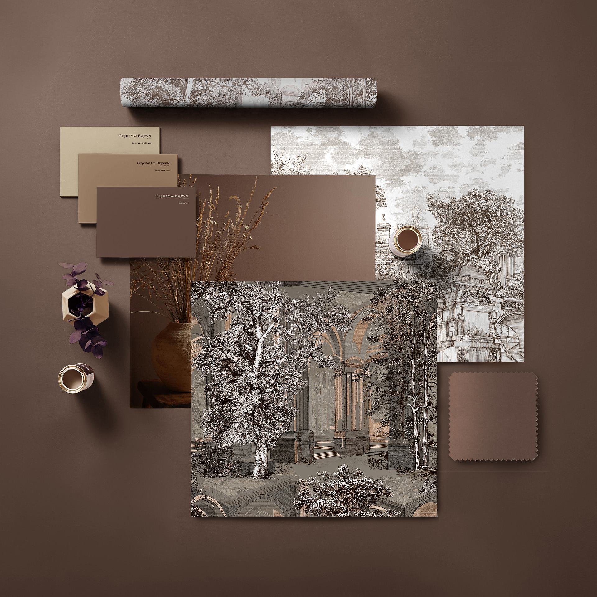
Choosing a brown tone as our Colour of the Year 2025 may seem like a bold move, but at Graham & Brown, we love the authenticity, the heritage and the vintage feel of this gloriously intense hue. Taking its inspiration from the humble Elder tree, our stunning Elderton paint represents just one aspect of our brown collection. From metallics to neutrals, earthy tones and bold retro hues, brown paint can transform your world.
In this article, we'll examine this much-misunderstood tint and discover what colours go with brown. We'll also discuss the different types of paints and where you can use them. From chocolate browns to burnt umber, caramel, or the merest hint of oatmeal, we'll show you how brown paint can give you a sense of grounding and connectivity to the natural world.
The psychology of brown
Associated with a sense of security, safety, and relaxation, brown has a positive effect on our psyche. Metallic browns such as bronze or copper can also instil a more luxurious ambience into a space, making it feel a little more special.
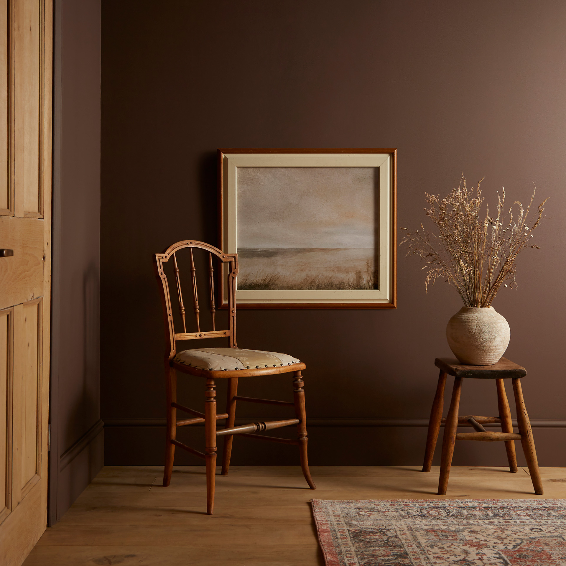
The neutrality of brown means that it can be combined with other tones or used as the primary aspect of an interior without becoming overwhelming. Brown turns a space into a comfortable, cosy environment. This makes brown a good choice for a bedroom, living room, or any space where you want to relax.
Brown also has strong connotations to nature, and brown paints perfectly partner well with botanical wallpapers, wall murals, and signature patterns. They balance and harmonise with a broad spectrum of colours, from yellows and greens to pinks and blues.
The brown spectrum – how different finishes can affect the result
The word ‘brown’ encompasses a wide range of tones, from taupe and coffee to rich chestnut or the subtly of Elderton. The type of paint you use will also affect the final look. For example, our Ultra Matt Resistance finish has an exceptionally low sheen rating of just 1%. By creating a deep, rich, less reflective surface, Ultra Matt Resistance produces a more sophisticated ambience that suits highly pigmented browns such as chocolates and caramels.
A higher sheen rating, such as with matt emulsion (with an 8% sheen rating), works well for lighter colours. The slight lustre reflects the light, making it ideal for walls and ceilings in smaller rooms to give the appearance of a larger space.
Interior eggshell can be used as accent colours on woodwork, skirting, door and window trims to add definition to an interior. The 25% sheen also works well to add an unusual accent on radiators and even furniture.
Gloss paint gives a high sheen finish that reflects light and works well with metallics such as copper. However, it’s wise to consider using gloss finishes in limited amounts to prevent them from overwhelming other elements of your interior. Our top tip: Use gloss white to add a flourish to more matt walls to underscore the tone and give a space definition.
For outside spaces, brown paint in exterior eggshell gives a refined look to front doors and windows, especially in heritage areas where brighter colours would look out of place. Tough, weather-resistant and long-lasting, it provides exterior surfaces with excellent protection from the elements.
Our top tip: Use a good-quality primer or undercoat before applying your top coat. If you're changing from a darker to a lighter tone, a good undercoat will provide a more neutral base to work with and prevent the final layer from appearing 'patchy'.
Five brown colour schemes for you to try
Each brown paint in our range has its own unique character. Let's take a look at five different colour schemes inspired by beautiful brown and which rooms they'll work best in for maximum impact. We'll also see which colours work best with brown.
Warm metallics
If you're using our gorgeous Elderton as the key colour component in your living room, add a little extra glamour with a warm metallic such as copper, brass, rose gold or bronze. Perfectly partner Elderton with a sophisticated metallic shimmer wallpaper and accent with a buttery cream eggshell on the woodwork and you have a balanced palette that's full of interest. For a more impactful statement, our Borneo Teal wallpaper combines a teal backdrop with a flourish of light-brown banana leaves for maximum visual effect.
Greys and neutrals
The brown palette crosses over into the neutral range, adding a softer, earthy feel to contemporary interiors. The trick with greys and neutrals is to layer the shades to create an ombré effect that softly takes you from a rich mocha through taupe into beige. An accent of grey gives it an interesting contemporary twist – choose a grey with a warmer red undertone to balance the earth tones. A modern living room or hallway is the perfect spot for this combination.
Dark blue or green
Brown paint works particularly well with other earth tones, such as dark blue or green. The trick is to get the tones to balance so that one doesn't try to compete with another. As they are on opposite sides of the colour wheel, they complement one another surprisingly well. Brown can be used to accent a wallpaper that focuses on greens and teals, while a pale taupe can bring a dark navy blue to life by preventing it from overwhelming a space. This is an ideal combination for a bedroom, where a more restful ambience is the goal.
Blush pink
Dusky rose tones or warm blush pinks are a perfect partner for browns. It’s an unexpected match, but the results can be enchantingly soothing and subtle. The colours aid concentration, making this combination a great choice for a home office or studio. The warm, welcoming nature also makes them suitable for hallways to set the tone of the rest of your home. Our tip: Combine this palette with our Silk Texture Blush wallpaper to add texture and character to a narrow space such as a hall or corridor.
Duck Egg blue
Finally, our perfect partner for brown is the delightful Duck Egg blue. This colour palette ranges from the palest of blues to almost green, making it an ideal choice for partnering with brown. The softness of Duck Egg makes it a great addition to smaller interiors, as it creates a sense of space and light. The addition of brown accents on woodwork, trim, furnishings and even soft furnishings lifts it and gives Duck Egg a bit more depth. Ideal for a sunny living room and a more traditional ‘country cottage’ interior look, it can also be used to create restful, soothing bedrooms.
Explore brown paint at Graham & Brown
Hopefully, we've inspired you to take a fresh look at brown and all the wonderful possibilities it presents for interior design. Why not browse the browns in our collection and find a tone that you love? Shop brown paints at Graham & Brown today.